While Sebamed stirred an ad war by taking potshots at HUL’s beauty soaps like Dove, Pears and Lux, Pampers released a tongue-in-cheek tactical film welcoming Virat Kohli to the joys of parenthood. Globally, Burger King unveiled a spectacular film introducing their new visual identity. These are the ads that Ritwika Gupta enjoyed this week. Take a look:
Brand: Sebamed
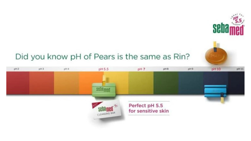
Sebamed, the German personal care brand, has stirred an ad war in the beauty and personal care segment. Titled ‘Filmstars kee nahi, science kee suno’, the brand’s new campaign unabashedly pulls up its competitors by name. It opens with a few women lounging around what seems like a luxurious hamam setting in silky togas (often seen in beauty soap ads). They explain that beauty soaps such as Lux, Pears, and Dove have the same pH levels as dishwashing soap bar Rin. A litmus test takes place to illustrate their point. Through this ad, Sebamed wants to empower consumers with the right information so that they can choose the best. The ad is direct and uncomplicated. In fact, the actors are also seen speaking with an absolute poker, straight face, while highlighting Sebamed as the real hero. For the uninitiated, pH level is a measure of how acidic or basic a substance is. On Instagram, Sebamed has uploaded a series of posts that explain what the pH scale is and why it is relevant. The scale ranges from 0 to 14 and the ideal pH level for sensitive skin is said to be 5.5. In this campaign, Sebamed is touting itself to be better because the pH of its soap is 5.5, unlike others. The ad smartly takes a jibe at traditional beauty soap ads, where the brands are recommended by famous film stars. Unfortunately, Bombay High Court has directed Sebamed to restrain all its ads. Therefore, you will not see any of their ads on TV or their official social media channels.
But I think the face wash brand has clearly made enough noise, generated conversations and accomplished what it wanted to. It has come out of the prescription category and gotten itself noticed in mainstream FMCG. Dove responded to the jabs though prints ads in leading papers such as Times of India and The Hindustan Times. The ad copy says, ‘Dermatologists have put something strong in Dove’s bar – their trust’.
Well, I don’t think Dove’s response works here because while the other soaps brands can talk about trust, brand loyalty and emotional connect, none of them can quite refute science. Well-played, Sebamed!
Campaign: #SebamedScienceKiSuno
Agency: The Womb
Brand: Pampers
Virat Kohli and Anushka Sharma welcomed their baby girl last week and since then, the couple has been receiving lots of love and well wishes on social media from all over the world. Pampers has unveiled a tongue-in-cheek tactical film welcoming Kohli to the joys of parenthood. Titled #DadsForVirat, the ad film sees fathers coming forth with advice for Kohli on facing the challenges of being a new dad. The film is a do’s and don’ts guide for the newly turned father. It shows a montage of dads hurling advice his way on how to hold this baby, change diapers, bathe his child and put his baby to sleep. I think the commercial breaks a dominant stereotype – taking care of a newborn and changing diapers is not only a mother’s job. And it does so, in a fun manner. The fathers in the ad are seen using cricket lingo and analogy like “swing”, “wrist work” and “slog”. The ad is also very well-timed, since it released just 2 days after the baby girl was born. Kudos to the team for leveraging the occasion and putting this film together quickly! Overall, Pampers delivers a positive message through this ad – “it takes 2 to parent”. It is super creative and hilarious.
Campaign: #DadsForVirat
Agency: Leo Burnett India
Brand: Burger King
Last week, Burger King announced its completely new visual design. Inspired by “real and delicious” food, the new logo marks the first complete rebrand in over 20 years. As per business insider, Burger King removed the blue from the logo because “there’s no blue food” – symbolic of the brand’s recent removal of colors, flavors, and preservatives from artificial sources. The fast-food chain not only rolled out a new brand logo but also new packaging, restaurant merchandise, menu boards, crew uniforms, restaurant signage and décor, social media and digital and marketing assets. To celebrate Burger King’s big leap forward, the brand launched a rebrand introduction video, summing up all the new visual design aspects. The stunning video features in-your-face photography that uses big, dramatic close-ups to get people to crave the food and communicate its taste. It’s got a playful, spectacular illustration style that catches your attention. The fonts are bold, the colours are warm and vibrant. It totally reflects the brand’s personality and attributes. The redesign includes the creation of a retro logo that closely resembles the logo used by the brand in the 1970s, 80s and 90s. From Back to the Future, Gremlins to more recently Stranger Things and BK’s Warhol campaign, the design pays homage to the brand’s heritage. It evokes a sense of nostalgia that will hopefully remind people of why they love Burger King in the first place.
Campaign: New Visual Identity
Agency: Jones Knowles Ritchie